
3 Top Tips for keeping it real with your Project Life
11:00
Hi, it's Ruth here today with a layout using the February PL kit and a few tips for keeping it real, my Project Life album is the everyday stories and memories from our lives, so I try to "keep it real".
Tip 1. Use the photos that truly represent your life.
No one starts out as a professional photographer. Practise helps everyone improve, but even someone who is good at it, doesn't always have the light conditions and the right equipment when everyday memories need to be captured. My keeping up tip is to give yourself a break and just use the photos that contain your memories, whatever they may look like.If that makes you nervous, then you can always post process them, though it can get time consuming if you let it. I generally don't use really blurry photos as they hurt my brain when I look at them.
I sometimes use phone apps like Pic.Tap.Go to improve my less than stellar photos, plus I use Picasa for effective cropping, straightening or other simple post processing, but I won't leave out something important just because it isn't my favourite photo. I include many photos in my PL that would not make it onto a traditional layout.
Tip 2. Keep it as Simple or Complex as you will enjoy.
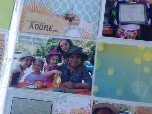
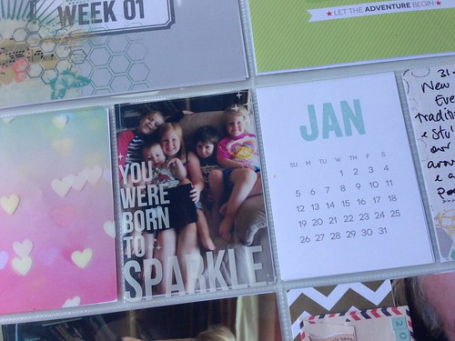
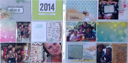
This is a project for the long haul, so pay attention when you are creating and when you are looking at project life pages to what you will enjoy doing every week or every month. It doesn't have to be the same all the time, but if simple works for you then go with it, if lots of layering is your thing, then do that, or a mix of both. There are NO rules except the ones you give yourself. This is your album to enjoy.Personally I mix it up depending on the amount of time I have and the supplies. For this month's kit I felt the cards were quite decorative, both the transparencies or the cards with lots of printed layers, so I didn't add a whole lot on top. Here is the final layout:
Tip 3. Balance your colours to make it pleasing.
Project life includes a lot of bits and pieces in lots of small pockets, from your ephemera and photos to products. Unlike a 12x12 layout there is not single piece in the background bringing it all together, so you need to take a look over the whole spread over the time you are working on it to check that the colours are balanced.Because you are including the real stuff, photos and content from your life, you need to pay attention to making it all work cohesively and one secret to doing that is to make the colours harmonious across the whole design. I try to have one or two colours that are spread across both pages. Here there is a triangle of pink, an insersecting smaller one in kraft and a diagonal line from top left to bottom right in green and teal colours that draws the eyes across the page.


0 comments